Why does a pale wash look so crisp?
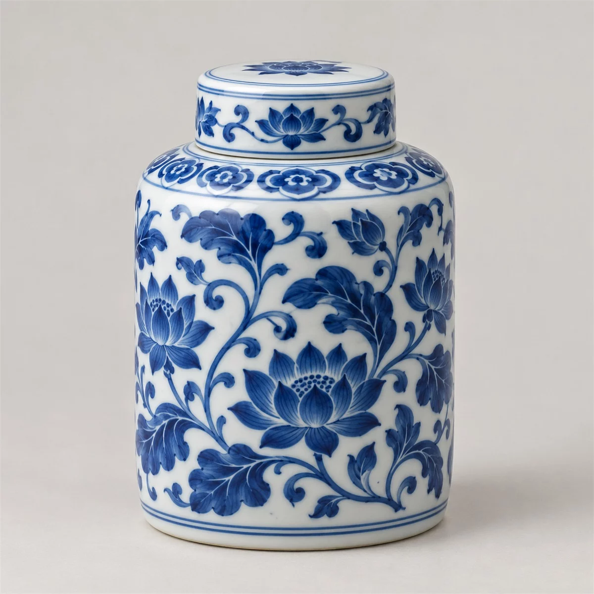
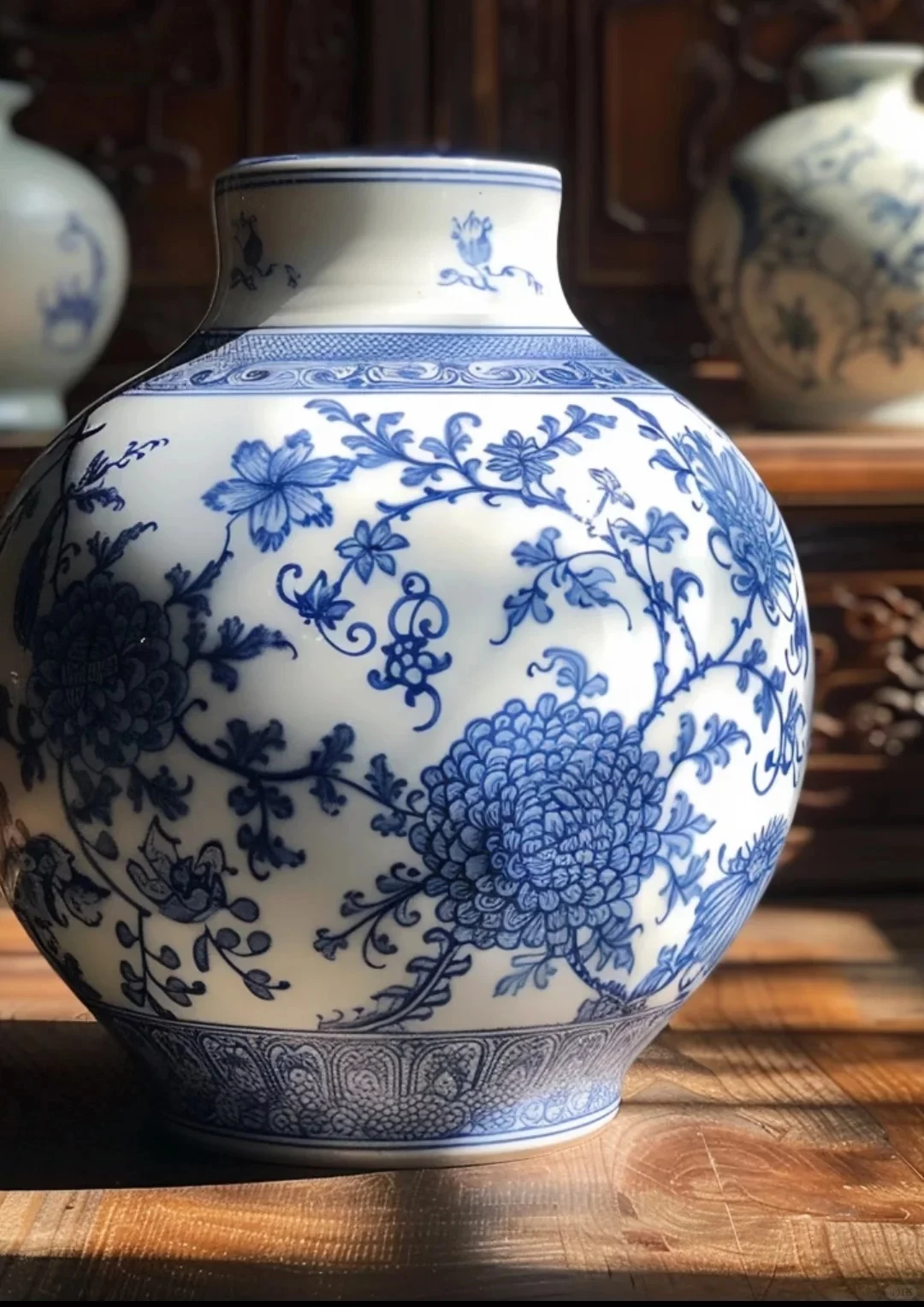
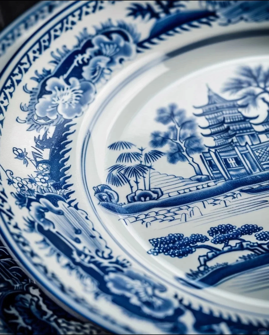
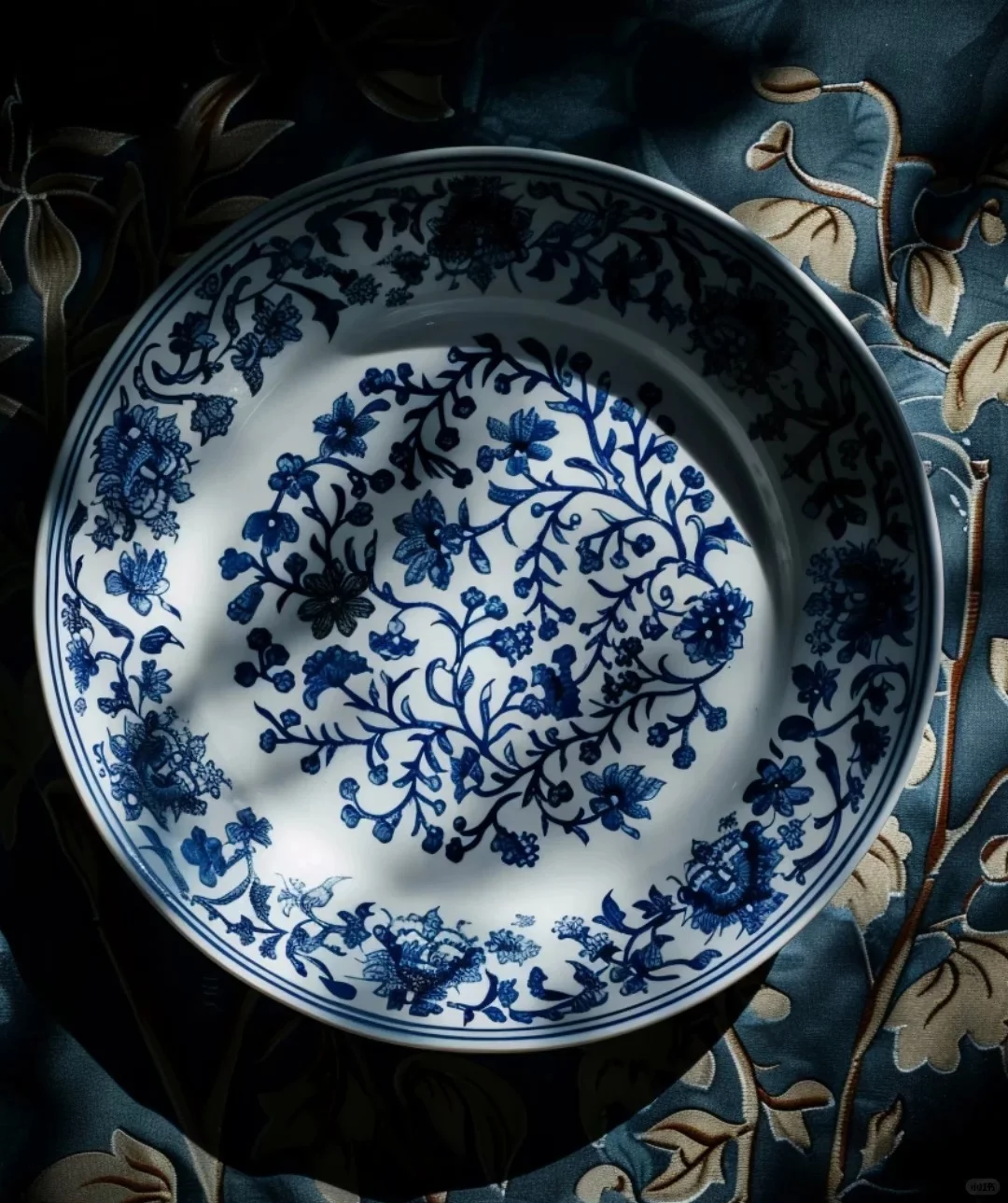
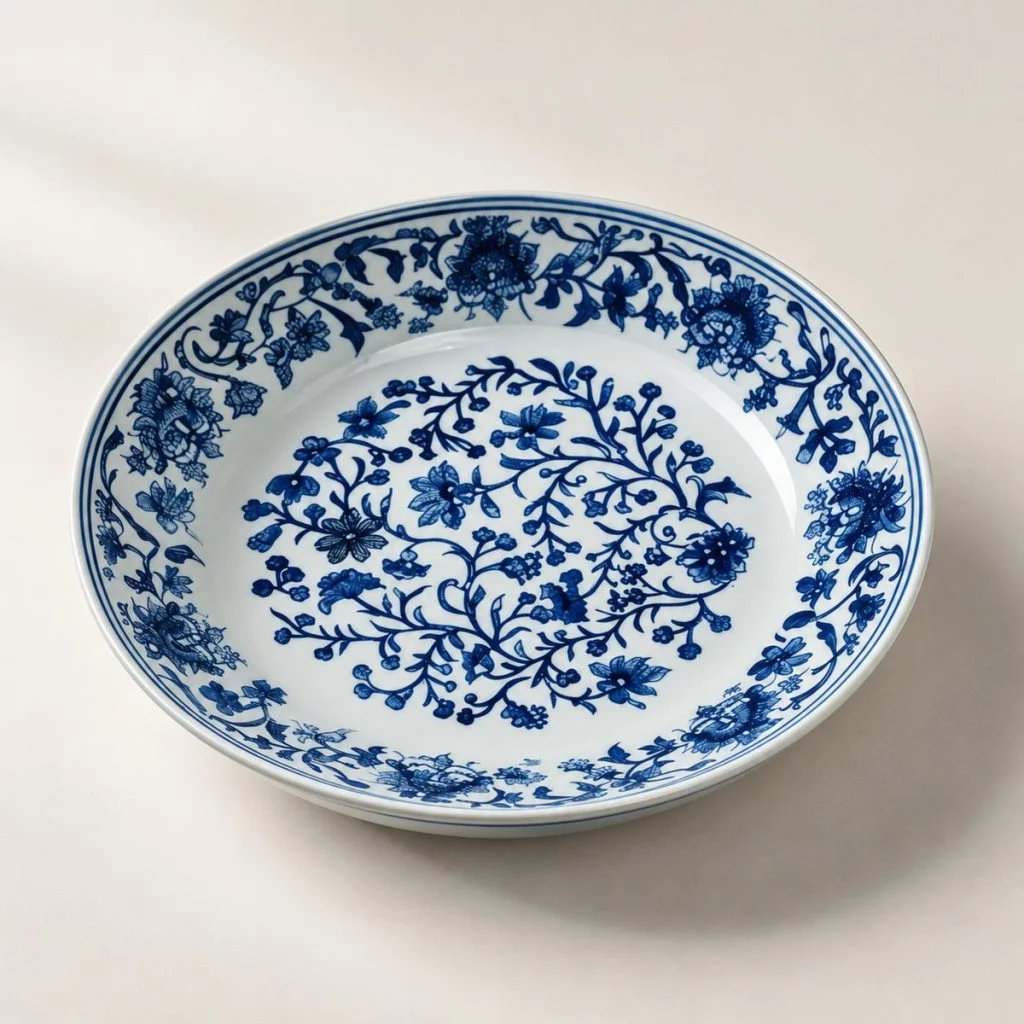
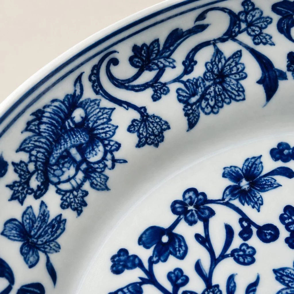
Most of this dish is a single light blue. The flowers, leaves and curling stems are filled with a thin, even wash, and what gives them their snap is the dark line drawn around each one. Strong outline, light fill: the contrast lets the pattern read clearly from across a table, the way a pen drawing reads more sharply than a watercolor on its own.
The layout is just as orderly. One scroll fills the well, a second runs without a break around the rim, and two fine lines close the edge. Nothing overlaps, and there is white between every element, which is why the dish looks lighter than the amount of decoration on it would suggest.
That restraint is much of what “export style” means: patterns Jingdezhen painted for tables abroad, designed to repeat cleanly around a rim and to sit comfortably among other dishes. It also makes this dish a good template. The same scroll can be redrawn for a dinner plate, a bowl or a serving platter, and the pieces will still look like one family.
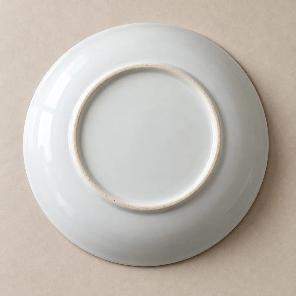
KKCN paints the dish at its Doufunong workshops in Jingdezhen and fires it once at about 1,300 °C, which locks the blue beneath a clear, hard glaze.
Why cobalt painted under the glaze does not wear away is explained in our guide to Chinese porcelain decoration techniques.